A Conversation with Rosie Stockton, author of Permanent Volta, and designer Rissa Hochberger
What goes into the making of a book cover? Take a behind-the-scenes look with Rosie Stockton, author of Permanent Volta, and Nightboat designer Rissa Hochberger on the visual inspirations which led to the final cover of Permanent Volta—from S&M lesbian pulps to falling vines to Lacan—and the process of creating a truly representative cover for the book.
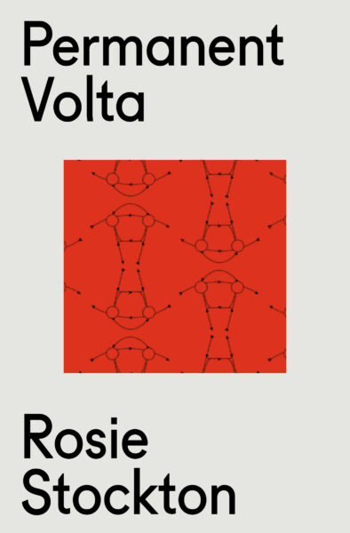
At the beginning of the process of articulating a vision for the cover of Permanent Volta, I offered a few abstract directions of moods we could go in: “flat / pamphlet / grecian / typeface forward” or “deserty nocturnal / sexed up pastoral / solarized image.” During our dialogue, Rissa returned a cover design concept that flipped Lacan’s graph of desire on its head, inverting the vector of the split subject’s intention and drive. Or perhaps, simply hanging the horseshoe shape upright, so dreams don’t spill out. Following this, we set out to bend the graph of desire to our will, imagining it made out of morning glory vines, out of chain graphics from the Chicago Leather Archives, out of plants from Rosa Luxemburg’s Herbarium, and finally in the style of Mountain Pollen’s drawings and tattoos. The illustration that appears on the cover is Mountain’s stunning envisioning of this prompt—to translate the slip between the graph of desire and the slow tangle of a morning glory vine. —Rosie Stockton
Rissa: I was looking at this first series of covers, where we substituted red for white in these grainy black and white images. In these the quality of the light is kind of like night vision, infrared, nocturnal light.
-
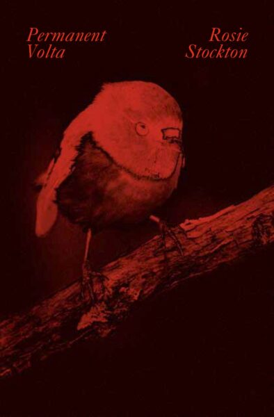
- An early draft of the Permanent Volta cover
-
- An early draft of the Permanent Volta cover
Rosie: The red of these first covers registered the communist positions of the poems. But also, they are so velvety, nocturnal and soft. They seemed to offer a visual affect of communal-eroticism.
Rissa: I love how you oriented our cover process with the idea that the cover is this veil for a book, that can also elicit desire.
Rosie: The function of the veil is connected to desire. We always want to know what is behind the veil. Maybe behind the veil is a secret, maybe it’s nothing—lack. These red covers feel like they invoke that secret.
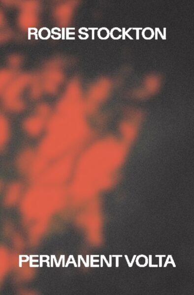
Rissa: Early on we were really into these solarized images, where the quality of light is bent. The light is inverted.
Rosie: I was thinking a lot about overexposure in these poems. How too much light is blinding, and obscures the image. Light, and its association with Enlightenment thought, correlates with modernity, rationality and individualism. Enlightenment metaphysics actually distort what we perceive, and necessarily sustain racist and colonial “othering” systems of thought and politics. I loved the ideas of fucking with the binary between lightness and darkness as one way to articulate love and care beyond these systems.
Rissa: Even with our final pink and metallic cover there is something like a solarized effect; the negative space flashes with light depending on how you’re holding the book.
I can’t remember if our prized design reference, the book cover of De Ring, by Dutch femdom erotica writer R. Fox, is metallic. I found it in the library of the Leather Archives and Museum in Chicago.
-
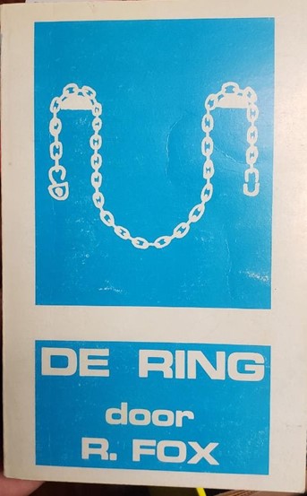
- An inspiration for the Permanent Volta cover: De Ring by R. Fox, found in the Leather Archives, Chicago
Rosie: I was so excited when you sent me this cover. It has a juicy plot: “An apparently insignificant erotic adventure develops in a few weeks into an all-subordinate sado-masochistic intoxication, in which a Dutch civil servant and an American flight attendant discover themselves…”
Rissa: I love that the drawing on the cover has this iconographic quality; the simple thick lines carved out as negative space. It’s an icon in that we can read the sub/dom dynamic into the chain graphic. But there’s an ambiguity in what a logo is referring to.
The Wilhelm Reich cover reference is a bit of a link between the R. Fox cover and Lacan’s graph of desire, which I had included in response to your comment about veils and psychoanalysis. Reich was an anti-fascist psycho-analyst who claimed that he had discovered and then isolated a unit of libidinal energy that he called the “orgone.”
-
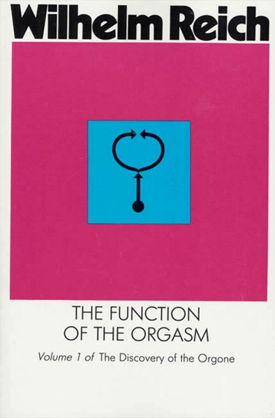
- Inspirations for the Permanent Volta cover: Wilhelm Reich’s “The Function of the Orgasm.”
-
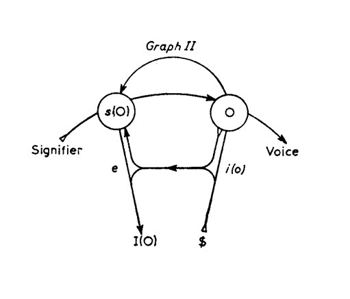
- Lacan’s graph of desire
Rosie: Do you know what that symbol on his books means?
Rissa: The really cuckoo thing for me is how under-described the points on Reich’s symbol are. It’s on the jackets of all of Reich’s books as though it’s this deep universal graphic, but it’s kind of indecipherable. That got me excited because it totally transforms the diagram into a purely aesthetic experience. It doesn’t function as a diagram anymore; you populate it as you wish. To me a functional logo can be read in so many directions, it can be rotated, and warped while still remaining familiar and legible.
I also am curious about how you made the morning glory as a graph of desire sketch. You texted me: “look at what fell at my feet.”
-
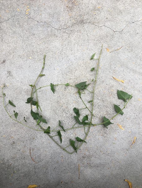
- Morning glory vines spotted by Rosie
Rosie: This idea was a response to you mentioning Rosa Luxemburg’s Herbarium, which, along with her letters and her essay on “The Mass Strike” are important to me. An excerpt from one letter acted as the epigraph to an early version of Permanent Volta. It reads:
“I feel so much more at home even in a scrap of garden like the one here, and still more in the meadows when the grass is humming with bees than – at one of our party congresses. I can say that to you, for you will not promptly suspect me of treason to socialism! … But my innermost personality belongs more to my tomtits than to the comrades.”
I love this contradiction: as if a revolutionary can’t have this intimate, sensuous experience of the world! Also, I was obsessed that you included a cover idea with a photo of a tomtit on it.
There is also an antagonism between the morning glory vines and the graph of desire. The graph is so mathematical and fixed. I imagined the morning glory vines could use it as a structure to climb around and take over, making it unrecognizable in the process.
-
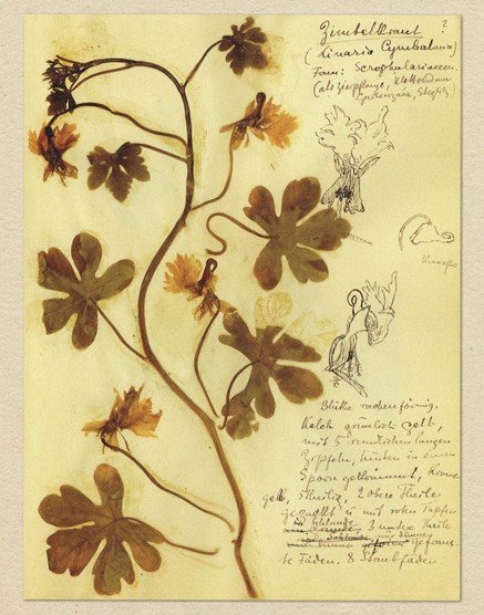
- From Rosa Luxemberg’s Herbarium
Rissa: Maybe that’s only possible when you evacuate all of the modifiers on the graph. That becomes part of this larger process of making the graph into a trellis.
Rosie: Yes! And the vines are so kinky. They wrap around and bind any structure in their proximity. Morning glory femdom.
The vines both use the graph-trellis and bend it to their will. That’s kind of how I imagine my relationship to poetic form and also state form. The vine takeover makes the form cease to work and signify like it is meant to. The sonnet/state could become obsolete according to its original function, and its architecture can now support new forms of life.
Rissa: I honestly don’t even know when I flipped the graph upside down, but I like to think that when the morning glory vines started growing around it, it started to spin.
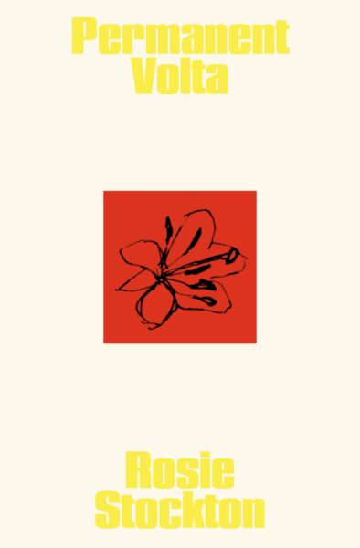
Rosie: I wondered why you turned it upside down. I thought it was a beautiful critique of the graph of desire, interrupting the directionality of the desiring subject. Once the spinning graph became a flower, it can’t return to its original upright state.
-
- A draft of the Permanent Volta cover
-
- A draft of the Permanent Volta cover
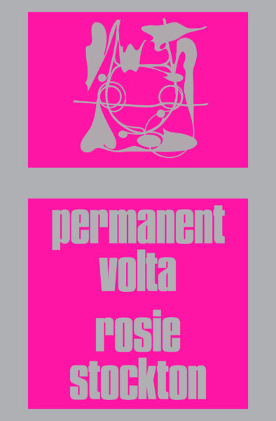
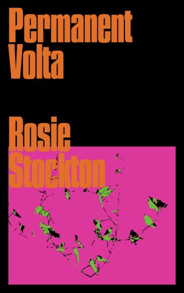
Rissa: This is when I had the idea for Mountain, a friend and tattoo artist, to redraw the morning glory / graph of desire in their style.
Rosie: That was such a beautiful idea, and the illustration is exquisite. A lot of friends have tattoos from Mountain. It feels like this index of interconnectedness. I am also wondering, how did you get to the color pink?
Rissa: I started playing with a lot of different colors when you wrote to offer that brighter colors might replace the initial reds. So I worked with a set of neon colors in blocks to reference the R. Fox cover.
-
- A draft of the Permanent Volta cover
-
- A draft of the Permanent Volta cover
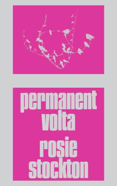
Rosie: My friend told me the pink reminded her of those plastic Home Depot flags you tie on an oversized load. I’ve tied those flags on so many loads of lumber for building projects. But here the oversized load are the poems, rather than lumber…
I also love how the silver you chose operates like a reflective street sign. It is almost cautionary.
Rissa: Yeah, there is something about Hi-Viz colors that is about communicating quickly and directly. It changes intensity depending on the light. The intensity does make it less about legibility and more of an object. It is recognizable, without even having to read it.
Rosie: It is very flashy, kind of audacious. Last fall, I saw a psychic and I asked them: “how do I comport myself in relation to my book? What kind of care does it want?” And they said: “your book is a brat, your book wants a higher credit card limit. It wants to go to the gay club and be out & about!” To me the pink cover invokes how sacred that playful excessiveness is, the importance of recalcitrance.
Rissa: The cover is so bright that it has me convinced that there was a possibility that it might glow in the dark.
-
- The final Permanent Volta cover