Happy publication day to Villainy by Andrea Abi-Karam! In an interview for the Nightboat Blog, Andrea speaks to Villainy designer and Nightboat editor-at-large Evan Kleekamp (who edited the book alongside editor-at-large Kim Calder), about the political brattiness of advocating for oneself, collaborating over Zoom, the Arabic script justification kashida, and much more. Take a look below:
Evan Kleekamp: So which one of us is harder to work with ?
Andrea Abi-Karam: I really don’t feel like I’m hard to work with though I am very particular about how my work is rendered visually and materially, as you well know :). As a poet who writes in nonstandard and unruly forms, such as: all capitals, lowercase i’s, colloquial text spellings, and invented spellings of language, I have consistently had to advocate for myself and my work for it to not get sanitized and standardized. One of the many reasons I loved working with you was that I never had to explain or defend my work — I always knew that you were on my side. I also felt that since I had been working with you and Kim Calder already for two(?) years on the editorial side, you were thoroughly familiar with the version and progressions of Villainy while still in manuscript. I loved how collaborative the design process was. Being able to meet over Zoom, screenshare, and move through the text and the different iterations of the cover in real time was incredible. I have an obsessive need to know why things happen and this collaborative process indulged me in that way.
EK: LOL you’re not hard to work with at all (can’t say the same thing about me though!), but I love the idea that advocating yourself is bratty, which we are, and I think your work and the decisions you make when moving between, say, some of the earlier performances that later became Villainy, demonstrate your unyielding commitment to doing things exactly as you want them done.
My joke about being difficult to work with is of course an inside but deeply political joke: we refuse to settle for less because we want it all. I feel like that commitment has become increasingly important because the imaginative spaces where artists—poets included—are able to freely experiment without presenting a market-ready, commercially viable experience are dwindling. In short, rent is too damn high, and artists whose work depends on having a space to rehearse, perform, or otherwise make face a number of financial hurdles just to maintain their practice. I think this financial precarity is actually the backdrop for the sanitizing and standardizing you mentioned: the more we expect artists to produce commercially successful work, the more that work will resemble a mass-produced commodity stripped of errors, with no individual qualities.
It’s funny that you mention working over Zoom because prior to the pandemic I used to open a Google doc or InDesign file on my television so I could work collaboratively with friends—often writing using my phone, which would then be projected on the screen. Creating a situation where everyone was able to collectively visualize, say, a cover not only expedited the process, it also gave people who might not know how to navigate the Adobe Creative Suite the ability to influence and direct the design.
AAK: I love that you were facilitating collaborative writing/creating spaces in real-time long before lockdown!
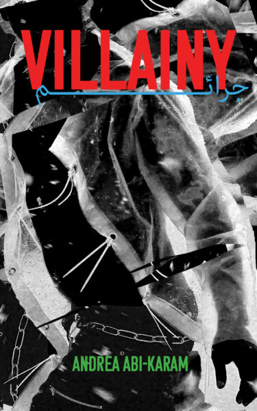
EK: With Villainy, we tried to reproduce that process over Zoom because you live in New York and I live in Los Angeles. You sent a mood board and the two things we clicked about early on were these colors that felt very retro, but had a certain dystopian, punk, or anarchist aesthetic. Many were throwbacks to ’80s films, especially movies where cyborgs, androids, and other forms of post-human life were central to the plot. There was a lot of red—especially blood red—but also these glowing pastel blues and greens from the gas-powered neon lights that were popular at the time. To me, those lights also hold a particular meaning in the international film lexicon, where they help us visualize an oddly composite future where elements of our ancient history and the intimations provided but cutting-edge technology come into contact. The lights often glow against extremely dark and foreboding backgrounds, which says much about how we imagine our future.
AAK: I was thinking of the color palette as 80’s hyper-urban sci fi, where night is eternal after humans have destroyed the planet. All of the neon blues, purples, greens, and reds are cool (as in not warm) colors like in Blade Runner and Ghost in the Shell that produce a visually haunting effect and also gesture towards queer nightlife spaces, like The Stud, where freaks can gather and release.
EK: The idea that we could refashion those color palettes and find a way to let them queer political valences through was also exciting. But so was adding the Arabic as a flourish to the cover. Letting people know that this book does not have the usual allegiance to the white publishing industry felt important, but also signaled to others readers of diasporic experience that you were thinking through many problems of language and culture that could not easily fit inside the book but, once flattened on the cover, served as a visual footnote.
AAK: Including the Arabic felt like such an integral visual layer. I chatted with designer and poet Sahar Khraibani and showed her some earlier drafts where the Arabic was more obscured behind the bold wall of VILLAINY. Sahar talked about how the kashida is used in Arabic design to elongate words in titles across languages (see also the covers of Mizna for reference) to give them parallel visual weights as the other language—so we gave that a try. From my experience in zine making and letterpress printing we spent a long time on this to get it right :).
In our early visioning of the cover, I remember you said you felt we should definitely include a body on the cover and I responded saying that since Villainy elevates collectivity I wasn’t sure a single body aligned with that—and you were like but wait your mood board is almost entirely figurative. We talked about how the text was so visceral that eclipsing that on the cover with something more abstract would feel as immediate. We worked together to create a larger than life, anonymous figure on the cover that exerts a militant resistance to the surveillance state alongside dystopian, punk, and anarchist cues rendered by the text.